Monday, June 30, 2014

Reconsidering Hoover

A generation ago, economists criticized Hoover’s reaction to the Great Depression in much the same way that other academics did.

Over the last 30 years, macroeconomists have been reconsidering the actual policies that Hoover have put in place, and reconstructed as much of the data as we can.

These days, macroeconomists view of Hoover is far different from what you’ll get in classes in other fields. Macroeconomists now recognize that Hoover’s policies were much closer to those of Roosevelt than to anyone else.

Check out this video from Lee Ohanion, probably the biggest macroeconomic expert on Hoover:

The takeaway from this is that we should view the New Deal (economically) as a set of Hoover/Roosevelt programs, distinct from the policies of earlier Republicans.

Sunday, June 29, 2014

Why Has Projected Rather than Actual GDP Flattened?

Real GDP isn’t what it should be.

Is this because the actual economy is on a flatter path than we’re projected to be on? Or is it because the projected path has gotten flatter, and we’re approaching it normally?

The CBO revised its opinion in spring 2014 to be consistent with the latter.

There are actually quite a few non-policy reasons why this might be true. But then there’s Obamacare: could this also reduce potential GDP?

Here’s a back of the envelope calculation from Greg Mankiw (quoted in full):

The Affordable Care Act added "about six percentage points to the marginal tax rate faced, on average, by workers in the economy."  So estimates the University of Chicago economist Casey Mulligan

Given that labor income was already taxed by income and payroll taxes, that figure indicates the return to working fell by about 10 percent. If we apply a plausible aggregate labor supply elasticity of 0.5, this in turn suggests a decline in labor supply of about 5 percent. In the long run, as the capital stock adjusts, a fall in labor supply leads to a proportionate fall in output. So we end up with a 5 percent fall in long-run potential output.

That calculation is very, very rough, but it does indicate that the ACA could well be a significant reason why the economy is not returning to its old growth path.

Update: Casey emails me that he believes the GDP effect will be smaller than this (about 2 percent or a bit more) because the impact on less skilled workers is greater than that on more skilled workers.  As a result, the mix of skills will change, and GDP will fall by less than total hours worked.

Note that this would be a permanent reduction in the level of potential real GDP. This says nothing about growth rates, so we would recover that loss with time. However, the transition from a slope with one intercept, to the same slope with a lower intercept (which is what Mankiw is talking about) would require a period of transition of a few years during which growth rates would be lower.

Friday, June 27, 2014

Forecasting Turning Points

This is more of an FYI post.

There are macroeconomists out there forecasting business cycle turning points, in real time, with a great deal more sophistication than the leading indicators that you hear about in the legacy media.

First some tips:

  • There are others besides these, but these are some of the big ones.
  • By default, each index may show a different time length along the horizontal axis. Check this and make sure you’re looking at what you think you want.
  • Most of the indices show recessions as upward spikes (but not all). The threshold for a turning point may be different for each one too.
  • Most of these come up with a probability that we are in recession currently.
  • Recessions are caused by different things (I refer to this as long lists of pros and cons), all of them small, and some of them hard to observe. There is a strong tendency to assume that the next recession will be caused by the same thing as the last recession. This is a serious problem because this almost never happens.
  • The last point is made worse by the tendency of humans to explain things with one big cause. If it were that easy, recessions wouldn’t be a problem.

Here are some links to forecasts that focus on financial conditions (because that’s what was important last time around):

Here are some links to more general indices of business conditions:

I tend to think the last one is the best. However, it’s an academic site rather than a commercial product, so you may need to poke around a bit to find the file/chart that’s been most recently updated (try the Figure and Excel links at the top).

FWIW: This sort of econometrics goes back to the pioneering work that James Hamilton (who is coauthor of the blog Econbrowser) published in Econometrica in 1989. Personally, I think Hamilton is on the medium-list for a Nobel Prize sometime in the next 20 years for this work.

Thursday, June 26, 2014

The Great Recession In One Map

This is a chloropleth (a political map shaded by some other variable). It shows which counties had median income go up or down from 2007 to 2012.

nd

We talk about recessions as if they’re national, but that’s only in an average sense. From this, it’s apparent that the Great Recession was mostly the southwest, the southeast, and some areas in the orbit of major cities: Detroit, Chicago, New York, Philadelphia, Seattle.

Do note the green region: this is the oil boom in the northern plains.

Via NationalJournal.

Should We Be Surprised By the Decline In Labor Force Participation?

One of the hobgoblins of the last few years is declining participation of adults in the labor force (recall that this means either working or looking for work).

Over the years, this blog has taken a strong position that this is mostly demographics: the population is aging, the baby boomers are starting to retire, the baby bust (of the 1970’s and 1980’s) is in their working prime, and the echo boom of this century hasn’t hit the job market in full force yet (and shouldn’t be expected to for a decade or so).

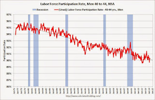
Here’s Bill McBride making a similar point at Calculated Risk. He’s more focused: is it a problem that so many middle-aged people are out of the labor force? Here’s a chart of labor force participation of 41 to 45 year old men:

Labor Force Participation Rate, Men, 40 to 44

I’ve blown up the image, so it’s a little hard to read the dates: the horizontal axis here goes back to 1976! So, it’s reasonable to conclude that the low labor force participation that we grouse about today (with Republicans saying it’s all Obama’s fault, and Democrats blaming it on … hmmm … just about anything that deflects attention from themselves) could have been predicted by anyone looking at the trends a generation ago. So, if this is a problem — and I’m not sure that it is — it is far broader than the policies of presidents and parties.

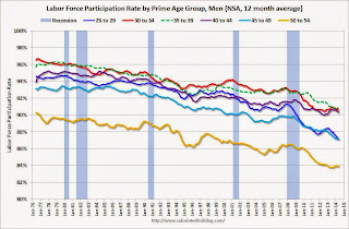
Calculated Risk goes a little further. Here’s the chart for all 5 year wide cohorts of men between 25 and 55:

Labor Force Participation Rate, Men, Prime Age Groups

Hmmm. Whatever is going on is also happening across all age groups.

Going one more step, realistically we should scale the vertical axis starting at zero, and scaled up so that the top of the chart matches the highest level we ever achieved. That’s the way most people assume a graph is made, and most don’t actually check. Here’s what we get:

Labor Force Participation Rate, Men, Prime Age Groups

Interesting. There’s definitely a decline, but frankly … this doesn’t look like much of a problem.

So, what’s the takeaway from this? I’m not sure myself. What I can say is that most men still work — so there hasn’t been much change. But a growing minority of men don’t work. That portion was small, and still is small. To me this does not indicate a pervasive problem with America. Instead, it indicates that there are two groups: participators and non-participators. And on the margin, we’re doing something over the scale of generations that is shifting marginal participators into marginal non-participators. That sounds like a gradual shift in the border between when work makes sense and when it doesn’t. Since recessions are marked clearly, I think we can casually dismiss that this shift is coming from the private sector. That leaves slow escalation in government benefits — over decades — as the likely cause. That suggests that the problem isn’t party policies, but the bureaucracy. Perhaps we need to think more about whether bureaucrats have a vested interest in shifting people out of participation.

Via Econbrowser.

Wednesday, June 25, 2014

Measuring Productivity

Improvements in the productivity of labor are the key to economic growth.

And while productivity comes from investing workers with more capital to use productively, the real secret to that is technological improvements that allow a worker to effectively control more pieces of capital.

But all this can be hard to see, so check out this video:

Do note that the pit crew is a lot larger, so the approximately twenty to one improvement in time in the pit may not be all productivity improvements. But, having said that, I’m guessing that the pit crew probably does a lot more now than they used to too.

Via Carpe Diem.

Monday, June 23, 2014

Scott Sumner on Piketty

I haven’t started Thomas Piketty’s Capital In the 21st Century  yet.

In the meantime, I’ve been overwhelmed by reviews from economists (and others) who have finished it (well, hopefully, at least … I have some doubts about some reviewers).

So I’ve avoided commenting on the book, or on the comments to it; although, like the proverbial duck, I’m doing a lot of work on this that isn’t easily seen.

Anyway, Scott Sumner came out with his review today at EconLog, and I think he makes a number of salient points. I think Scott’s politics and economics are roughly similar to mine: fiscally conservative, socially liberal, and with macroeconomics background more firmly grounded in the mainstream of the 1970’s and 1980’s than academics of older or more recent vintage. Here’s what he said.

I recently completed reading Thomas Piketty's new book entitled Capital in the Twenty-First Century. Piketty explains why the distribution of capital is becoming increasingly unequal, why we need higher tax rates on upper income individuals, and also a wealth tax on the affluent.

That’s a good skinny to start out with. In this next quote, I agree with the first two sentences and while I believe the last sentence, I find the implication a bit appalling:

You probably won't be surprised to hear that I was not persuaded by his arguments. I didn't expect to be persuaded. But here's what did surprise me; the book made no real attempt to persuade me. [emphasis original]

Sumner then goes on to explain his position, and you can read that it in the original. Later, there’s more of the same:

Going into the book I expected Piketty to try to persuade people like me … But he didn't do so; indeed he didn't even make an attempt to do so. The book is aimed at thoughtful non-specialists who don't know about all the cognitive illusions in the public finance literature. [emphasis added]

In short, Sumner argues that the book is aimed at people who think they’re smart enough to avoid the pitfalls, but who are ignorant that they exist at all.

Then Sumner hits on one of my pet peeves:

… He repeatedly uses the term 'wealth' to refer to marketable wealth, when he actually should be talking about total wealth, including the present value of future government benefits like Social Security and Medicaid, as well as human capital. To be sure, there are some purposes for which singling out marketable wealth might be appropriate, but discussing changes in economic inequality over time is not one of those purposes.

My peeve is that we tend to worry most about inequality when it involves something that is both valuable, transferrable, and fungible.

  • No one care that we have inequality in penmanship, because it was valuable once upon a time but isn’t valuable any more.
  • No one cares about inequality in ball handling skills, because even with the best coaching they aren’t transferrable.
  • No one cares about inequality in the tastiness of home cooking, because even recipes don’t make that very fungible.

To me, it’s a sign of real problems when we’re only worried about inequality in relatively liquid assets: like they’re big bags of cash that belong to the holder.

Sumner concludes:

… I am obviously not the intended audience for this book. And if I look beyond my annoyance, I can understand why many readers found the book to be impressive, even a tour de force. … Piketty's book is impressive in some ways. I like his approach to methodology. He might well be correct about some of his predictions. As we saw with the General Theory, a book can contain many individual arguments that don't hold up, and still be a milestone in the intellectual debate.

Saturday, June 21, 2014

What Makes Macroeconomics So Hard: Regifting One of the Oldest Ideas As a Basis for Policy

We’ve always done it this way is already a part of my “What Makes Macro So Hard” lectures.

This one is subtly different: presenting the way we’ve always done things as something new. Essentially … regifting.

Here’s Thomas Sowell discussing Obamacare:

… What is older than the idea that some exalted elite know what is good for us better than we know ourselves? Obama uses the rhetoric of going "forward," but he is in fact going backward to an age when despots told everybody what they had better do and better not do.

Around the world, that elite may be determined by different means: age, skin color, wealth, education, social affiliation. And I’m not claiming that they’re not right more of the time. What I am claiming is that there ought to be more than this as a basis for policy.

I like to think I have better sense than most Repubicans/conservatives/liberarians/classical-liberals: I freely recognize and admit that Obamacare is essentially Romneycare, which in turn is largely the Republican alternative to Democrat proposals circa 1990.

What bugs me about policymakers, in this case the Democrats and Obama, is the claim that this is something new. It isn’t.

How is Obamacare old? Consider:

  • … When confronted with the fact that millions of Americans stand to lose their existing medical insurance, as a result of ObamaCare, defenders of ObamaCare say that this is true only when those people have "substandard" insurance.

    Who decides what is "substandard"? …
  • … One of the fundamental reasons why private medical insurance has gotten so expensive is that politicians in state after state have mandated what this insurance must cover, regardless of what individuals want.

    Insurance covering everything from baldness treatments to sex-change operations is a lot more expensive than insurance covering only major illnesses that can drain your life's savings. Now these mandates have moved up from the state to the federal level.

    Insurance is an institution for dealing with risks. It is a costly and counterproductive way to pay for things that are not risks -- such as annual checkups, which are known in advance to occur every year.

    Your annual checkup does not cost any less because it is covered by insurance. In fact it costs more, because the person who is insured must pay premiums that cover not only the cost of the checkup itself, but also the costs of insurance company paperwork. ...
  • ... Another way in which ObamaCare is an old political story is that it began as supposedly a way to deal with the problem of a segment of the population -- those without health insurance.

    But, instead of directly helping those particular people to get insurance, the "solution" was to expand the government's power over everybody, including people who already had health insurance that they wanted to keep.
Note the pattern in the bold emphasis I added to each quote. It isn’t about hope and change, it’s about old guys in suits and ties and their busybody enablers telling everyone else what to do.

Why Isn’t Japan In the Toilet? Because Most People Writing About Macroeconomics Can’t See the Forest for the Trees

I’m not going to claim that Japan is in great macroeconomic shape. In per capita terms, the country may not have peaked around 1990, but there certainly was a big kink in growth rates that occurred at that time. And Japan has been struggling with weak aggregate growth every since.

But, this is not the story you’ll here in the legacy media where comparisons of (national) debt to GDP are accepted without question. To these folks, Japan has the highest debt/GDP ratio of any developed country, and is headed for a crash. Here’s a common view:

To illustrate just how woeful Japan’s fiscal conditions are now, one merely has to look at how they were in March 1945. About half a year before Japan’s military-controlled government surrendered, Tokyo was borrowing at a feverish pitch to pay for its losing war effort and the Bank of Japan was furiously printing money to cover the soaring deficit.

The central government’s debt-to-gross domestic product ratio stood at 204% at the end of March 1945.

More than half a century later, this ratio–a key measure of a government’s ability to pay down debt–is already above that milestone. The Ministry of Finance estimates it will reach 227% by the end of March next year.

That’s from The Wall Street Journal, which is supposed to know better.*

Do note, before I go on, that this is the same argument by people who worry that the U.S. is in trouble because our national debt is about 100% of our GDP (both are around $17T, give or take).‡

The thing is, this is mostly nonsense. Innumeracy at a basic level is being demonstrated here. Specifically, you can always compare a stock variable to another stock variable, you can always compare a flow variable to another flow variable, but when you compare stocks to flows you get a rate, and you need to be very careful that your interpretation of that rate isn’t nonsense.

In this case, debt is a stock variable defined in yen. GDP is a flow variable measured in yen per year. Do the math: the correct figure is not 227% but 2.27 years. Reciting that it’s 227% is a scare tactic. Stating that it’s 2.27 years sounds like nonsense because it is. This measure that they’re crowing about means that if Japan devoted all of its national production to paying off national debt, it would take 2.27 years. Except that’s silly because all the residents of Japan would starve.

Appropriate alternative comparisons, which can still show that Japan is in bad shape but which rest on a foundation of numeracy, include comparisons of national debt to national wealth (both stocks) or GDP to interest payments on the national debt (both flows).

The amazing thing is that this article actually includes the former, but, it’s down at the bottom (where no ever reads), and it’s really small (because it doesn’t tell a story that the sky if falling that will sell newspapers):

If there’s one asterisk to put after the shocking comparative figures, it’s that the debt-to-GDP ratios don’t take into account Japan’s huge asset holdings. At the end of March 2012, Japan’s central government had assets totaling some Y600 trillion, roughly half of its total liabilities projected for next March, separate MOF data show. And those assets include Y250 trillion in cash, securities and loans. Critics often say Japan’s fiscal health could quickly improve if the government sells some of those assets …

Folks, they’ve just put an asterisk on the only part of the article that’s actually coherent. Pity.

* Economists know that the reporters for The Wall Street Journal are not particularly conservative/libertarian, and can’t be expected to be an improvement over most other legacy media outlets. It’s the editorial page that sets The Wall Street Journal apart, and which upsets so many progressives.

‡ If you are worried about the national debt, please worry about the present value of unfunded future obligations, which is about 13 times larger. The problem with (announced) debt is how you make the payments to your debtholders. This means that unfunded obligations are the exact same problem, just with a different name.

Monday, June 16, 2014

Perceptions and Macroeconomics

There’s a lot of people … no … let me change that … a real lot of people … who think the economy sucks.

As a macroeconomist, I sometimes think this is akin to a mental illness. Basically, reality is what we interpret internally, of the the external things all of us can see. A psychologist would be very comfortable interpreting an internal reality that is different from the external reality experienced by others as a mental illness.

I’m concerned about this as a macroeconomist because policy is based on our external expression (through voting) of how we see the world internally. And I don’t want to see internal distortions embodied in policies that apply to all of us.

One of the huge things that people are missing about the contemporary economy is the huge increase in consumer surplus: the value that you would pay for but that you don’t have to any more.

For example, 20 years ago, the revenues of a much larger music industry were counted in GDP. The consumer surplus that people got from listening to music was not. Today, there’s a component of GDP based on the revenues of the music industry that’s much smaller than it used to be. And yet everyone knows we have more and better music, in more places, than ever before: in short, our unmeasured consumer surplus has gone through the roof.

But consumer surplus is hard to observe, and easy for the pessimistic to avoid or downplay. So every once in a while it’s important to point it out.

Consider this article from the New Yorker about one of the hot new fads in services based on smartphone apps: laundry services that pick up and deliver. It’s entitled “Let’s, Like, Demolish Laundry'”.

Here’s the thing: the entrepreneurs who are featured in the article graduate from business school in 2005 and moved to Buenos Aires to be entrepreneurial.

The question that should pop into your head is: WTF?

Let’s spell this out. They graduated from a Big Ten school (Indiana), with a particularly good business school (the Kelley), in the midst of an expansion that (although not popularly noted) turned out to be the 5th longest on record. They then moved to Buenos Aires, capital of the country that is every macroeconomists answer to how you can screw up your country’s economy.

WTF? How goofy does your internal view of the world nearby have to be to think that’s a good idea?

They were frustrated by what they found:

… For kids in their early 20s, they had done impressively little screwing around. Dulanto, a Florida State graduate, had opened a juice bar, which is where he met Metzner and Nadler, friends from Indiana University who were opening a place called California Burrito next door. Two years later, Dulanto had opened a second juice bar, and California Burrito was a chain of 14.

At the time, Argentina’s wet noodle of an economy was foundering. Every day, California Burrito had to readjust prices to keep up with inflation. The conveniences his friends at home took for granted were a far-off dream. “iPhones were like $2,000. We were paying ourselves like $1,200 a month. And I realized that I was missing out on the great luxuries of the American lifestyle.”

N.B. To macroeconomists, Argentina’s economy has been floundering for about 90 years.

Here’s what they found when they moved back:

But these accomplishments seemed meager when the friends returned to visit their home country. Things were very different from how they’d left them, and, like time travelers, they regarded the changes with awe. “Everyone had a Prius and everyone had an iPhone and everyone had Direct TV, and I was just like, Whoa,” Metzner says one afternoon this spring, sitting in the Washio break room, a sunny space in Santa Monica with an array of snacks and a fridge full of beer. “And I’m not, like, very materialistic at all,” he continues. “Like, I’m not a person who can’t live without my iPhone. But I’m thinking to myself, like, Wow, there’s a lot of life I’m sacrificing …

I put it to you that what they sacrificed was almost all consumer surplus. It is a huge social and political problem for America (and other countries) that we’re not getting this point.

Economists Don’t Go Around Saying that Labor Markets Are Weak When They Aren’t

It’s a popular meme around the country — students say it, politicians say it, and the legacy media says it — but it isn’t true.

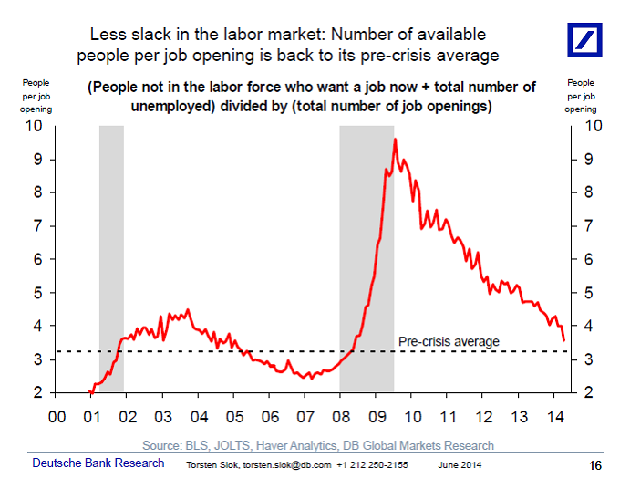
Labor markets just aren’t that tight; from Greg Mankiw’s Blog:

Yep: 2014 is as bad as 2004. Y’all remember 2004, right? President reelected. Economy in the 5th longest boom since World War II. Real GDP growth rates that Obama can only hope for? We’re back to that.

Do note that most of the people who say labor markets are weak also seem to have a weakness for supporting their position with anecdotes instead of data.

Sunday, June 15, 2014

It’s Equality That’s Unnatural

Income inequality is a big deal this year (what with Obama pushing it, and Piketty’s book coming out).

Do note that it seems to be only income inequality that anyone worries about. Inequality of consumption, or skills, doesn’t seem to enter the picture. That’s kind of twisted actually: we’re worried about you have more income to buy the bigger ice cream cone, but once you’ve bought it we don’t worry about the inequality much any more.

In fact, inequality is everywhere, but we worry about it most when it’s in the form of fungible cash.

The thing is, many people will remark that somehow income inequality is a sign of a problem. That it’s somehow intentional, and therefore unnatural.

It may well be intentional, but inequality is far from unnatural. In fact it’s the norm.

Physicists know why; they call it entropy. Basically, equal distributions of things are unlikely.

To see this consider how to divide up 6 bits of stuff between 3 people. One way to do that would look like this

(6,0,0)

That’s called an ordered triple, And obviously it represents inequality; equality would be (2,2,2).

Now, I’ve chosen the numbers to make this relatively short. Keep in mind that there are 3 cases: I could have given the 6 to any of the 3 people in that set. I didn’t, but if I had, all I would be doing is multiplying the number of ordered triples I’d have to write out by three, without adding much insight. So I’ll skip over that and work around the first person in the ordered triple.

Now, continuing on, suppose the first person got 5. Now there are two possible ordered triples:

(5,1,0)

(5,0,1)

This is less unequal, but also more common.

Now consider if the first person got four:

(4,2,0)

(4,1,1)

(4,0,2)

In total, there are 6 possible distributions already, and not one of them is equal. Continuing on we get the following (and perhaps you are starting to see the pattern in how I generate the triples):

(3,3,0)

(3,2,1)

(3,1,2)

(3,0,3)

(2,4,0)

(2,3,1)

(2,2,2)

(2,1,3)

(2,0,4)

(1,5,0)

(1,4,1)

(1,3,2)

(1,2,3)

(1,1,4)

(1,0,5)

(0,5,1)

(0,4,2)

(0,3,3)

(0,2,4)

(0,1,5)

In that last group I’m skipping (0,6,0) (0,0,6) because that would match the first triple I introduced, just in a different order.

Even so, I have 26 orderings, and only one of them has equality.

What’s the takeaway from this? It’s that we should expect to find inequality just about everywhere, and we shouldn’t conclude that this is the result of intentional choice/discrimination.

Think about it. Basketball skills are unequally distributed, and no one finds this surprising or objectionable. Thriftiness is unequally distributed, and no one finds this surprising or objectionable. Hazel eyes are unequally distributed, and no one finds this surprising or objectionable. Singing ability is unequally distributed, and no one finds this surprising or objectionable. Cavities are unequally distributed, and no one finds this surprising or objectionable.

But now it gets weird.

Pennies are unequally distributed, and no one finds this surprising or objectionable. And yet pennies are a form of wealth. Aren’t we worried about the unequal distribution of pennies? Nickels too. And dimes, quarters, and even one dollar bills.

I’m going to go out on a limb here and suggest that there’s be a lot more objection to the redistribution of wealth if everyone had to either give up, or receive, a wad of one dollar bills — so that it was very visible what you gave up or what you got. This means that checks, or better yet, income tax withholding, make it far easier to make the case the inequality is unnatural. It isn’t. Remember this in discussions with friends from other backgrounds who want to debate this particular macroeconomic point. 

Extraordinary Interactive Detail About the Job Market

The New York Times has produced an interactive graphic that you must go to their site to use properly. It’s called “How the Recession Reshaped the Economy in 255 Charts”.

What it shows is monthly job growth over the last 10 years plotted against compensation, through time, broken down by over 200 industrial classes that cover about 75% of the economy (damn … professors isn’t one of the categories covered).

Sunday, June 8, 2014

DSGE Models

In Spring 2014 I talked a bit about DSGE models. DSGE stands for Dynamic Stochastic General Equilibrium. Models like this are how macroeconomists answer serious questions theoretically.

Discussions of them started showing up in principles books a few years back. In intermediate macro, students need to know that the descriptive/Solow growth models that they work with in class are the starting point on a road that leads to DSGE models.

Anyway, now there’s a blog that covers results strictly from DSGE models: NEP-DGE Blog.

Saturday, June 7, 2014

Ooh Ooh: A Prediction for Spring 2015’s Class

This article appeared in Harvard Business Review in May 2014.

It predicts an unemployment rate of under 5% by summer 2015.

Can’t wait to see how that prediction turned out at the end of the Spring 2015 semester.