Maybe a little bit, but not by enough to be concerned.
This is discussed by Menzie Chinn, writing at Econbrowser. This is a good post for a macroeconomics student starting to do time series.
Chinn is a much better macroeconometrician that I am; but my approach would be the same: estimate an ARIMA regression and compare the White House forecasts to it.
We’re not going to go as far as an ARIMA model in class. ARIMA’s have 3 components: autoregressive (the AR), integrated (the I), and moving average (the MA). We will start doing AR regressions with Case 2 in the text. Then we do an I regression with Case 4, and an ARI regression with Case 5. Each of those is followed by a number that roughly indicates the complexity of the model. We do an AR(1), then an I(1), then an ARI(1,1). Chinn does an ARIMA(1,1,1). So his results are one regression past what you’ll be doing on homework towards the end of March.* Chinn, or me, or any Ph.D. doing time series could come up with a more complex regression, but the message you need to take away is that at the top levels we find ARIMA regressions to be quite satisfactory … and producing them is a good skill for you to carry away from this class.
What the White House (and CBO) does is announce point estimates of growth rates. They probably could produce interval estimates, but they don’t announce these. A TV weatherperson thinks the public is smart enough to consume interval estimates, but D.C. does not.
Anyway, Chinn uses his ARIMA(1,1,1) to produce a point estimate too. But he also know that the probability of that point estimate getting an exact hit is essentially zero, so he doesn’t bother showing it. Instead, he uses it to produce a 95% confidence interval (we’ll just do point estimates in class). Here’s his chart:
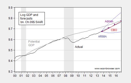
It’s a bit hard to make out his colors and symbols. His 95% confidence interval is the two curves on the top and the bottom at the right that produce a widening range. That’s what his regression says is likely over the next couple of years. The point estimates from the White House are the black triangles, and the CBO point estimate is the (slightly different) red line.
Basically, the White House (and CBO) point estimates are pitched right down the middle of what’s likely. The White House estimate is a tiny bit higher … but still right down the middle. From this, it’s reasonable to conclude that the White House is not being overly optimistic.
Now, one thing Chinn doesn’t discuss is his potential GDP estimate. Note that he’s got the gap between actual and potential GDP closing. Further, his potential GDP arcs downward a little, rather than growing at a constant rate. So, Chinn is definitely assuming that there has been some sort of structural slowdown in the U.S. economy, and that relative to that, we’re doing a good job of closing off the gap. That’s a decidedly pro-Democratic view: his potential GDP starts curving around 2003, so he’s definitely saying something went wrong 10 years ago (when Bush was in charge), and that it isn’t fixed yet. Perhaps he’s right … but he is assuming that position, rather than defending it. I don’t think you should judge him harshly on that (I’m not sure he isn’t right) … but I do think I’m supposed to train you to spot that sort of thing.
* FWIW: You really can’t do an MA in Excel, so if I were to take you that additional step, we’d need to use some more serious stats package like R or gretl. That’s not a huge hurdle, but big enough to push it beyond the scope of this class.
No comments:
Post a Comment