Thursday, February 27, 2014

Business Relearn the Value of Economists

Business hires of economists are booming.

The number of private-sector economists surged 57% to 8,680 in 2012 from 5,510 in 2009 …

The reason is that economists are pretty good at handling and understanding big data.

A lot of companies have programmers who are able to process big data," said Tom Beers, executive director of the National Association for Business Economics in Washington, a professional organization with about 2,400 members. "But to find a causality between two things and draw a conclusion really takes somebody with an economics background."

A more cynical reason is that when times are good, everyone thinks they can do forecasting.

Retired economist Frank Schott, 87 years old, said new veins of data don't guarantee accuracy in forecasts. "The data are just as recalcitrant as ever to give you answers and the multiplicity of it invites further confusion," he said. "Everybody, including corporate bosses, thinks they're their own best economist."

The thing is, about 75% of the time the economy is in good shape, so there’s a good chance for confirmation bias. During the Great Moderation (the name given to the mild economic period from 1983-2007) many companies pared down their economics staff.

"The great recession laid bare a lot of fundamental mistakes that an economist can be useful in preventing," said Mr. DeKaser, who was previously chief economist for National City Bank.

There’s more in the article entitled “Corporate Economists Are Hot Again” in the February 27 issue of The Wall Street Journal.

P.S. Oh, and, what sort of firm actually employs a Chief Economist? How about Google. Hal Varian (who wrote the Ph.D. micro text most of used in graduate school) is their guy.

Wednesday, February 26, 2014

Some Income Inequality and Redistribution Facts (And Why to Take Them Not Quite So Seriously)

In all walks of life, there are facts and then there are “facts”. I’ve used quotes to indicate things that may actually be true, but don’t say what we think they do.

There are few facts about income inequality. The reason is that the data we’re talking about is not really inequality, but rather the distribution of income. And that’s an empirical statistical distribution (ooooh, nasty stuff to some people) with over a hundred million data points (one for each household). And those households aren’t very forthcoming about how much they make. Put those together, and most of what we have are “facts” not facts.

So, there’s a lot of “facts” floating around, and the Obama administration has been pushing them lately. But conservatives have their own “facts”. A good example of this is the op-ed piece from the February 13 issue of The Wall Street Journal entitled “Here's What 'Income Equality' Would Look Like”. It’s by Scott Hodge, President of the Tax Foundation. This is a D.C. think tank that is nominally non-partisan, but which for practical purposes tends to line up with conservatives.

One statistical fact we need to deal with up front is that the distribution of income is severely positively skewed (most economic and financial data is). This means that if you were to graph the entire distribution, it should have a long tail on the right hand side. The reason for that long tail on the right hand side is that there’s a floor on how low incomes can go (at zero), but there’s no ceiling on how high they can go (some incomes are over a billion dollars per year).

The thing is … no one has the entire distribution in front of them. So we guesstimate. But our guesstimates need to preserve that positive skew. The way this works out in practice leads to some weirdness with the numbers.

One immediate implication of positively skewed data is that the average will be higher than the median. You can see how this works with some simple data sets. If we have the data set:

1,2,3

It should be clear that a) the data is symmetric and not skewed, b) the average is 2, and c) the median is 2 as well.

But if our data set is:

1,2,6

It should be clear that a) the data is no longer symmetric and that it is positively skewed, b) the average is now 3, but c) the median is still 2.

Household income data looks like the second data set, so average income is likely to be larger than median income. This also means that the majority earn less than the average.

Most of our data on income inequality is divvied up into 5 quintiles. Within those quintiles, we’ll see the same problem. So when Hodge says:

A typical American family in the lower income quintile, on the other hand, has an average market income of $9,560 …

He’s also saying that the median family in the lowest quintile earns less than this. Inferring medians is just about impossible without seeing the whole data set, but you could take a stab at this and figure that the median income of the lowest fifth is in the $6-8K range.

Hodge also says:

… Those in the bottom fifth, or quintile, of the income scale received $9.62 in federal spending for every $1 they paid in federal taxes of all kinds.

Again, this is true, but it’s a “fact”. In that quintile, most taxes are probably paid by people at the top end, and most benefits are brought in by the people at the bottom. So the 9.62 to 1 ratio is kind of comparing apples to oranges: it’s infinity to one for some and probably zero for others. But … it’s what we’ve got, so it’s what we use … even if it’s a “fact”.

At the other end of the spectrum the weirdness gets worse. Households in the top quintile average $311K in income, but because of the skewness this must be much higher than the median. The same follows with net taxes, which are $65K for households in this quintile. Those are facts. But his assertion that you’d need to take $164K from each of these households to bring that quintile to average income is a “fact”. This amount is ridiculous (and borders on inflammatory) because that would put the majority of the households in that quintile below the average; the factual version would be much smaller. And that’s presupposing that such a scheme would be worthwhile.

The bottom line of all this is that you should be on the lookout for innumeracy from D.C. types on both sides of the issue.

FWIW: Hodge does site two useful, fact rich, summaries of income and tax data: The Distribution of Federal Spending and Taxes in 2006 from the CBO and The Distribution of Tax and Spending Policies in the United States from the Tax Foundation.

Tuesday, February 25, 2014

Natural Logarithms

Just in time for me to start talking about taking natural logs of our macroeconomic data, come two supportive posts.

As a field, we do a huge disservice to students by not starting out with logarithms in both macro and micro principles. At SUU we’re probably worse than average at this (my personal opinion is that the cop-out “I’m not good at math” is especially prevalent in Utah).

Anyway, future Nobel Prize medium-list contender James Hamilton, writing at Econbrowser, offered up the post entitled “Use of Logarithms in Economics”.

The comments section of that post led me to Miles Kimball, writing at Confessions of a Supply-Side Liberal who offered up a long and detailed post entitled “The Logarithmic Harmony of Percent Changes and Growth Rates”. Here’s what he says:

… I let students in my Principles of Macroeconomics class in on the secret that logarithms are the central mathematical tool of macroeconomics.

Both mentioned a feature of percentage changes and logarithms that I kinda’ sorta’ understood, but never completely put together in my mind. I don’t know if there’s a formal name for this, but there’s a fallacy that gamblers often fall for (and that, of course, casinos love). Investors fall for this too. It’s this: if you start with $100, win 50% of that, bet it all, and lose 50% … you’ll end up down $25. Check the math if you don’t believe me. I also know that a change in a natural log of 0.5 approximates a 50% gain. What I didn’t put together is that this fallacy doesn’t occur if you use the natural log approximation: if you start out with any natural log, say 4, gain 0.5, bet it all, and lost 0.5, you’ll end up back at 4. 

The algebra of this fallacy is that if you start with x, and go up by a percentage p, you end up with this:

x(1+p)

But if you now go down by (1-p) you end up with this:

x(1+p)(1-p)

Note that this is only equal to x when either x or p is zero. So, I didn’t have to to choose $100: it would’ve worked with any amount that wasn’t zero. And I didn’t have to choose 50% for p: any percentage that isn’t zero will get us the same result.

The reason for the fallacy is that what we’re really thinking is that there’s a multiplier; call it y, so that after one round we end up with:

xy

And after the second round we end up with:

xy/y

Obviously, if you cancel, this will get you back to the initial x. And the above equation will work with logs.

Arithmetic as Magical (Policy) Thinking*

You’ve been warned: this repost from my personal blog, pasted below the horizontal rule, is too politically loaded for the content to be required for this class.

I’ve included this here because of the current controversy over Obamacare’s forecasted effects on unemployment, and the difficulty of understanding the implications of means-testing and marginal tax rates.

No one, anywhere, would settle for a discussion of policy that was illiterate. But all too often we settle for policy discussions that are innumerate.

I don’t want to come across as a math ogre, but as a student you’ve got to get in the habit of crunching the numbers. It matters.

==============================================

From John Hinderaker writing at PowerLine:

… On the Left, a “wonk” is any liberal who can multiply and divide. But liberals often trip over even that low threshold.

This regards a proposal to address income inequality by seeding everyone with a small taxpayer-funded trust fund at birth.

This actually is a pretty good idea (and one that has also been made in different formats on the left and right). The difference is that the people on the left do the math wrong, and then run with it.

Then he quotes from a reader’s contribution about widespread innumeracy on the political left:

But, as our reader says, this kind of magical thinking on the Left is not unique to Ornstein. On the contrary, an inability to understand the most basic principles of arithmetic constantly dogs liberals. How else did we get Obamacare? Moreover, Ornstein was not alone. Didn’t National Journal have an editor who read the piece and said, “Whoa! $3,500 to $700,000 at 5%? Did you check the math?”

Please note that the current version of the linked article does acknowledge the math mistakes in a footnote.

==============================================

* Magical thinkingthinking that if a person hopes for something enough or performs the right actions that an unavoidable event can be averted — is a good concept to learn about in a well-rounded college education. One of the things that I’ve found as a macroeconomist, that makes teaching macroeconomics difficult, is the extent to which students (on the left and right) maintain macroeconomic views are studded with the magical thinking of folk economics.

Technorati Tags: ,

Friday, February 21, 2014

Means-Testing, Overlapping Social Programs, and Marginal Tax Rates

THIS HAS BEEN UPDATED NOW, SO DISREGARD THE VERSION THAT WAS AVAILABLE FOR 4 HOURS ON FRIDAY MORNING.

Here’s a primer on how marginal tax rates work, and how they interact with means-testing.

First off, we describe taxes as either marginal or lump-sum. Marginal rates are set as a percentage of something else, like income taxes. Lump-sum taxes are set as a set fee that’s (more or less) constant, like the cost of fishing licenses.

Politicians like marginal rates because it’s a lot easier to collect a lot of money if you’re just skimming a percentage off the top. For perspective, our households total annual federal income taxes are in the range of the value of a new car; can you imagine having the cash around to buy a car in one lump-sum each April 15? It’s not gonna’ happen.

Economically, the thing is, marginal taxes distort people’s decisions, making them do things they wouldn’t otherwise. Lump-sum taxes do that sometimes, but not always, and definitely on a smaller scale … mostly because they’re simple binary choices that are over and done with right away.

In practice, marginal tax rates look like this. Suppose you pay a flat tax of 10% of your income:

Gross Income Taxes Paid Net Income Effective Tax Rate
0.00 0.00 0.00 0%
1.00 0.10 0.90 10%
10.00 1.00 9.00 10%

Easy, right?

You can already start to see a very simple aspect of how marginal tax rates are distortionary. Even though everyone pays the same marginal tax rate, their effective tax rates are different: choose not to work, and your choosing a different tax incidence.

We complicate things by adding steps to our flat tax rates. We could smoothly adjust tax rates, but we usually don’t. Instead we say the rate is 10% on your first $10, and 20% on anything above that. Like so:

Gross Income Taxes Paid Net Income Effective Tax Rate
0.00 0.00 0.00 0.0%
1.00 0.10 0.90 10.0%
9.00 0.90 8.10 10.0%
10.00 1.00 9.00 10.0%
11.00 1.20 9.80 10.9%

This is still pretty easy. The distortion which economists worry about is more complex now: adding the step has made the effective tax rates change unevenly.

There’s one important thing to notice about the system in that second table: the highest marginal rate exceeds the effective tax rate. The reason for this is that the effective tax rate is a form of weighted average.

Now let’s suppose we add a social program, whereby everyone gets a guaranteed income of $1, say by a lump-sum tax credit. Now the table looks like this:

Gross Income Net Tax/Subsidy Paid Net Income Effective Tax Rate
0.00 0.00 - 1.00 = -1.00 1.00 -infinity
1.00 0.10 - 1.00 = -0.90 1.90 -90.0%
9.00 0.90 - 1.00 = -0.10 9.10 -1.1%
10.00 1.00 – 1.00 =  0.00 10.00   0.0%
11.00 1.20 – 1.00 =  0.20 10.80   1.8%

Not so easy now, right?

What is really interesting though, is that this implies that once we have a single marginal tax rate that’s distortionary … it makes the new system of two overlapping tax rates distortionary, even if one of the taxes is lump-sum.

Digression: If you’re confused right now, join the club. But, it’s important that as an economics student that you work through this and get it right. Being befuddled by the math has a name: functional innumeracy. It’s like functional illiteracy, except with math. Personally, I think a lot of our problems with means-testing come about because most politicians, bureaucrats, the media that covers their actions … and voters … are functionally innumerate

Now consider what happens if we add means-testing. What is that exactly? It basically means that some social program has steps that make it progressive. Everyone thinks these are a good thing (and to a certain extent they are): less welfare for those that are richer.

Except this really screws up our effective tax rates. Consider a 50% reduction in that $1 subsidy that kicks in at a $5 income:

Gross Income Net Tax/Subsidy Paid Net Income Effective Tax Rate
0.00 0.00 - 1.00 = -1.00 1.00 -infinity
1.00 0.10 - 1.00 = -0.90 1.90 -90.0%
9.00 0.90 - 0.50 =  0.40 8.60   4.4%
10.00 1.00 – 0.50 =  0.50 9.50   5.0%
11.00 1.20 – 0.50 =  0.70 10.30   6.4%

Again, it’s a pain to work out the arithmetic. What’s important is that each step we bring in from a single program increases the number of steps and complexity we observe in the final effective rate.

Now, here’s what governments do: they keep adding new programs, each with their own means-testing steps. And sometimes the situation gets complicated enough that weird stuff starts to happen. Consider this table; now I have a third program that pays out $1 to everyone with income under $9.50, and nothing to everyone else:

Gross Income Net Tax/Subsidy Paid Net Income Effective Tax Rate
0.00 0.00 - 2.00 = -2.00 2.00 -infinity
1.00 0.10 - 2.00 = -1.90 2.90 -190.0%
9.00 0.90 - 1.50 = -0.60 9.60   -6.7%
10.00 1.00 – 0.50 =  0.50 9.50   5.0%
11.00 1.20 – 0.50 =  0.70 10.30   6.4%

The key result comes from the steps that are set independently: we now have the bizarre situation where a pay cut can lead to higher net income.

How do we get into this mess? Roughly it’s because Democrats propose new social programs to attract votes (because everyone forgets about the last time the introduced a new program). Republicans find it’s politically unpopular to oppose those programs too strongly. So instead, they choose to do something stupid, and impose means testing. And the Democrats go along with this because 1) they get their program, and 2) they look conciliatory and tough at the same time. The end result is multiple overlapping programs with steps in different positions.

Casey Mulligan has made the argument that the ARRA (aka “the stimulus package”) put 4 million people in the position of paying a tax in excess of 100% on marginal income. In short, they take home more money if they don’t work. Here’s a chart from his testimony before Congress:

image

The bar indicates that, prior to the passage of ARRA, most of the benefit to working for this group of people was offset by taxes and lost benefits. The response of Congress to the weak economy was then to tack on more benefits, with enough means-testing to make it unbeneficial for some to work.

What are those programs? Looking at the chart, most of them stayed the same. But, they increased the Earned Income Tax Credit, they created a new program called FAC (basically, extended unemployment benefits), added another new one called SCAP (basically, new and improved food stamps), and introduced a subsidy to help offset the costs of the existing COBRA program (that allows the recently unemployed to keep their health insurance with their old employer for a couple of years).

All of those sound good, and they probably are. They are certainly good-hearted. But combined together, what they’ve done is created a Frankenstein monster: a whole that doesn’t behave as we’d like, cobbled together from parts without enough introspection.

What can we do about this? Step one would be to get rid of this green-eyeshade, bean counting, approach to government finance. We need more gatekeeping on ideas before they become law, and less penny-pinching on the back end. Step two would be to get rid of the idea of progressive steps: not only do we need flat taxes, but we need flat benefits too. In that light, substitution of a guaranteed income program for existing overlapping programs would be a good thing. But, if you check the proposals, substitution doesn’t happen, supplementation does. And that doesn’t solve this problem at all.

Thursday, February 20, 2014

Obamacare and Employment

One piece of big news this month has been the new estimates of the effects of Obamacare on employment.*

The old estimates had shown that employment was going to go down by just under 1 million people. The new estimates showed it would go down by about 2.5 million. That’s going from a 0.6% reduction in employment to a 1.5% reduction.

Both estimates came from the CBO (Congressional Budget Office). The CBO is generally viewed as non-partisan by both parties.†

What did happen this time around is that the CBO updated their methods, largely based on the influential work of Casey Mulligan. In particular, Mulligan researched the tax disincentives for employment under the Act. Specifically, the lower your cash income, the higher the proportion of healthcare benefits in your compensation package. Those healthcare benefits are, in turn, “means-tested”. I know this sounds kludgy, but “means-tested” means that as your income goes up, you start to get charged for the free parts, essentially paying a tax that wasn’t there before. Fifty years ago, prominent Democratically-aligned economists recognized that means-testing was problematic. Mulligan provides this quote:

… James Tobin, a John F. Kennedy adviser, Nobel laureate and leading Keynesian economist of his day, said in a 1965 article, a 100 percent tax rate causes “needless waste and demoralization,” adding:

This application of the means test is bad economics as well as bad sociology. It is almost as if our present programs of public assistance had been consciously contrived to perpetuate the conditions they are supposed to alleviate.

And, let me stick my neck out here and generalize: means-testing is the fault of Republicans. Instead of making principled (but politically unpopular) stands against welfare programs through the years, they’ve instead consistently settled for (economically ludicrous) bean counting.

Here’s Mulligan’s estimates of marginal tax rates averaged across taxpayers:

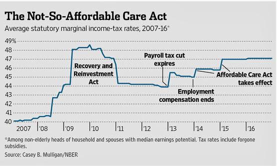
Mulligan’s point is that Obamacare cranks up the average across taxpayers of the marginal tax rates each of them pays (the two steps on the right) mostly by increasing the marginal tax rates on people with lower incomes (through means-testing). Do note that the first of those steps just occurred, and the second one is still 10 months out, so the effects on employment have barely started. Mulligan thinks the CBO estimates are a big improvement, but that they’re half of the reduction he forecast in his earlier work.

Do note and emphasize the point made: means-testing makes Obamacare a healthcare benefit for many paired with a substantial increase in marginal tax rates on the incomes of the poor.

Fair enough. Now, take a step back and think about our labor and healthcare markets of, say, 10 years ago. There’s a lot of reasons to think that the way we paid for healthcare then was goofy (most employees receiving a benefit that could be more or less than they need because their employers get a tax break, with a fairly small minority left to their own devices) and in need of reform. Did this distort labor markets? Almost certainly the answer is yes. Now we’ve introduced a healthcare law that distorts labor markets in a different way. My point is that we can’t just say that the distortions are worse because they’re different, when in fact the situation may have improved along some dimensions So, both conservative and liberal views have some validity here (do note that John Cochrane, a much more important economist than me, and one who I usually agree with, stated that my view that it’s possible that the “effect of [earlier] government policy was to induce too many people to work is just silly.”).

The thing is, prior to passage supporters of Obamacare stated publicly that the act should be expected to increase employment.

Mulligan is actually pretty clear about this:

Why didn't they say, no, we didn't mean the labor market's going to get bigger. We mean it's going to get smaller in a good way …

His point is that supporters of Obamacare always argued casually that it would increase employment and that this was a good thing. Those supporters never examined deeply whether their supposition was correct. Now that deeper analysis has been done (by Mulligan) and confirmed (by the CBO), the supporters of Obamacare argue that it will decrease employment and that’s a good thing too.

Here’s Tyler Cowen writing at Marginal Revolution:

People, it is rather difficult to have it here both ways.

Cowen’s writing is usually very clear, but I found this post very confusing. Let me summarize. His position is that:

  • Progressives have argued that the Great Recession was caused by a shift of aggregate demand to the left.
  • The policy solution to that is something like the stimulus package of 2009, or the loose monetary policy of the last few years: both intended to shift aggregate demand back to the right.
  • A policy solution is necessary because progressives/Keynesians assume people act irrationally on the aggregate supply side: when there’s a bad demand shock suppliers should reduce their (nominal) prices to maintain their (real) output. The progressive position is that suppliers of labor, in particular, have expectations that irrational in that they believe bad times won’t last and therefore don’t reduce their (nominal) wages quickly enough to avoid large scale (real) unemployment. These three points are Cowen’s one way.
  • Cowen’s other way is that Obamacare supporters are now arguing that labor suppliers, in particular, are rational and will recognize that with Obamacare in place they can choose to spend their time in ways more fruitful than employment.
  • So what Cowen is saying is that there’s a really big logical hurdle to clear if you’re going to use workers’ irrationality to justify one big progressive program, and workers’ rationality to justify the other big progressive program.

Another way to interpret these arguments is through the likely effect on the unemployment rate. Remember the goofy thing about official measurements of unemployment: you have to want a job enough to be actively looking in order to be counted. The position of liberals/progressives is that some people are going to shift from being employed to being out of the labor force rather than unemployed. If this is true, there won’t be much affect on the unemployment rate. For example, right now, the unemployment rate is roughly:

10/(140+10) = 6.7% (where everything is in millions of people)

After the ACA changes take effect, we will see something like this:

10/(137.5+10) = 6.8% (where everything is in millions of people)

On that basis, it looks like no big deal. I predict that this argument will be used in the major media over the next two years.

Alternatively, the conservative position is that what really counts is that right now 140 million people are doing the production that supports the other 170 million (a ratio of 1 to 1.21). After the ACA changes take effect, it will be 137.5 million doing the work for 172.5 million (a ratio of 1 to 1.25). That’s 3% more work for the workers.

You might think that this is OK because those 137.5 million will be getting paid more because they have to be more productive. Here’s Princeton economist, and former Vice-Chairman of the Federal Reserve, Alan Blinder making exactly that point. Greg Mankiw shows that this is naive. His argument is one that we’re going to start this month, and work on through the rest of the semester. In short, this sort of policy change is going to cause a permanent decline in the level of real GDP. This will be proportional to the decline in employment, so wages will remain unchanged.

John Cochrane also brings an important point to bear on the problem. My wife has a wry joke for people who complain about not liking their jobs: that’s why they pay you. If you liked it, you’d do it as a hobby. Here’s Cochrane:

Hey, work isn't fun. We do it for the money. If not for the money, for the health insurance. Sure, it would be great if the government would cover my health insurance, my food, gas, and housing, so I could devote myself full time to glider flying.

Think about that. Why exactly are we worried about job-lock for healthcare, when most of us are already in a state of employment-lock for food, shelter, transportation, entertainment, education, and so on? The only difference is that for those items we’re locked to having a generic job, while with healthcare we’re locked to a specific job. Perhaps the specificity is the problem we should have been addressing all along. Do you think anyone in Washington seriously considered whether they could address that specificity without putting 2.5 million people in the position of finding it beneficial to choose leisure over employment?

In the end, there isn’t a solid answer here. Instead, we’re comparing before and after when the features are jumbled. Before, we worked more hours, got more real GDP, but got less healthcare and less leisure. After, we’ll work less hours, get less real GDP, but get more healthcare and more leisure. On average. The true problem here is distributional: some people think the before scenario will still apply to them, and that the after scenario will apply to someone else. That’s a big problem.

FWIW: Craig Newmark offers the following point about the liberal/progressive position:

I love that Liberals have now decided that what individuals voluntarily choose--regardless of the consequences for the rest of us--is fine. Question for them: shouldn't we therefore allow individuals to choose whether or not to have health insurance and if so, what kind?

* Obamacare is the name of convenience. The short name for the law is the Affordable Care Act, so you will see ACA used quite a bit.

† The big problem with the CBO is that they evaluate the economics of laws as they are written by Congress, not how they are put into practice by the executive branch or later modified by Congress. It’s become standard practice in Washington to include items in laws to game the CBO estimates that are later reneged upon (that isn’t what’s happened in this case, but it is a concern with Obama’s executive orders changing the requirements under the Act).

Sunday, February 16, 2014

America’s Ridiculously Large Economy

From Mark Perry of Carpe Diem, a comparison of U.S. Gross Metropolitan Products with the GDP of comparable countries:

Rank Top 20 US Metro Economies, 2012 GMP, Billions Equivalent Countries 2012 GDP, Billions
1 New York-Northern New Jersey-Long Island, NY-NJ-PA $1,335.1 Spain $1,322.1
2 Los Angeles-Long Beach-Santa Ana, CA $765.7 Netherlands $770.1
3 Chicago-Joliet-Naperville, IL-IN-WI $571.0 Iran $551.5
4 Washington-Arlington-Alexandria, DC-VA-MD-WV $449.7 Belgium $483.4
5 Houston-Sugar Land-Baytown, TX $446.9 Argentina $477.0
6 Dallas-Fort Worth-Arlington, TX $418.6 Austria $394.4
7 Philadelphia-Camden-Wilmington, PA-NJ-DE-MD $364.0 Venezuela $382.4
8 San Francisco-Oakland-Fremont, CA $360.4 Colombia $369.8
9 Boston-Cambridge-Quincy, MA-NH $336.2 Denmark $314.9
10 Atlanta-Sandy Springs-Marietta, GA $294.0 Singapore $276.5
11 Miami-Fort Lauderdale-Pompano Beach, FL $274.1 Chile $268.3
12 Seattle-Tacoma-Bellevue, WA $258.8 Egpyt $254.6
13 Minneapolis-St. Paul-Bloomington, MN-WI $218.5 Pakistan $215.1
14 Detroit-Warren-Livonia, MI $208.4 Ireland $210.6
15 Phoenix-Mesa-Glendale, AZ $201.7 Kazakhstan $202.6
16 San Diego-Carlsbad-San Marcos, CA $177.4 Ukraine $176.3
17 San Jose-Sunnyvale-Santa Clara, CA $173.9 New Zealand $171.2
18 Denver-Aurora-Broomfield, CO $167.9 Romania $169.4
19 Baltimore-Towson, MD $157.3 Vietnam $155.8
20 Portland-Vancouver-Hillsboro, OR-WA $147.0 Iraq $149.3

The U.K.’s New and Improved GDP

A well-known problem with GDP is that it does a poor job of counting income that people don’t want counted. In particular, the income of people who choose jobs that are illegal.

So, following the lead of the EU, the non-member UK is going to start including estimates of the value added of the illegal drug trade (£3B) and prostitution (£7B).

Those figures amount to 0.2% and 0.4% of GDP. If you ask me … that’s too small.

The source article is gated, but you can get what you need from this post at Huffington Post.

Saturday, February 15, 2014

Arthur Chu (Not Required)

Trent brought up Arthur Chu last week. He’s the Jeopardy champion who uses “game theory”. I found a few things on the internet about his play (a long interview at Mental Floss, a short piece with some video at Yahoo Finance, some snarky opinions at The Daily Mail). 

I found very little indicating that Chu is using any game theory, as the field is known to social scientists. I found a lot indicating that Chu may have some theories about this specific game.

In particular, Chu’s “bouncing” around the board doesn’t seem any different than choosing to be unpredictable in any game. Last I checked, I’ve been playing tennis that way since I was 11.

And Chu’s “strategy” for Final Jeopardy doesn’t seem any more nasty and devilishly insightful than the standard strategy used by bidders in The Price Is Right. And no one complains about that.

I wonder if there’s some racism involved. Or lookism … Chu isn’t exactly photogenic.

Required for Exam 1, 2/19/14

1) All old posts in the list in the sidebar to the right.
2) Chapters I to IV of the text, and all lecture materials.
3) The first 3 questions and answers from the Quodlibet on my website.
4) Specific questions abut homeworks (or Excel) will not be asked. General questions about the concepts involved are fair game.
5) All these posts made on this blog since January 1:
No posts more recent than this one will be covered on the test. Also, these posts will not be covered on Exam 1.

Thursday, February 13, 2014

A Misconception About Income Mobility

It is often touted as a fact that it’s far less likely for someone to move out of the lowest income quintile than it is for someone in the middle class, and that it’s far less likely for someone at the top to move out than someone in the middle.

This is a fact. But, it’s a totally useless fact.

Consider this table:

http://object.cato.org/sites/cato.org/files/wp-content/uploads/scf_mobility_table.jpg

The bold numbers show this fact. The table is drawn from this post by Alan Reynolds writing at Cato at Liberty. David Henderson made a similar point on Econlog. Reynolds is generally regarded as a conservative who is too partisan. Henderson is merely a Libertarian. I found there explanations a tad weak.

For my part, what we need to be looking at is the numbers just above or below the diagonal. Like so:
69 22 5 2 1
19 49 24 7 2
7 21 45 23 4
3 7 22 50 18
2 1 4 18 78

I’ve just repeated the numbers here (and rounded for simplicity). If we’re concerned about downward mobility, we need to highlight the 4 cells where it’s possible for someone to go down. When I look at those 4, I don’t see much evidence that downward income mobility depends much on your current position.

Doing the same for upward mobility I get:

69 22 5 2 1
19 49 24 7 2
7 21 45 23 4
3 7 22 50 18
2 1 4 18 78

Again, there's a small difference in the numbers, but not much.

Is the Employment/Population Ratio Decline As Big a Problem As It Looks?

Employment is down. A lot.

Many people attribute this to the Great Recession. Poke around a little with the search tool to the right, and you’ll see that I’ve been pushing the idea on this blog for a few years that we’re in the midst of a long-term demographic wave: it peaked in the mid-90’s, and participation has been declining ever since. I attribute this to the baby boomlet (sometimes called the echo boom). The raw data looks like this:

Ch1_ep-ratio

That looks like a pretty serous case for a bunch of people dropping out of the labor force due to the Great Recession, and not coming back (presumably because of the weak expansion).

Not so fast argue economists from the Federal Reserve Bank of New York. The broke down the population into 280 cohorts: basically, fractions of the population assumed to act about the same way. For example, I might be grouped with white males born in 1964. They then modeled the employment/population ratio for each of those groups, and aggregated them up. And here’s what they got:

Ch3_ep-ratio

The first chart corresponds roughly to the rightmost third of this chart.

What they found is that the effect of the Great Recession is still there, but it’s quite small: the red line is less than 1 percentage point below the blue curve where it’s estimated that it should be.

The Great Recession (and Weak Obama Expansion) really has 3 components: 1) a drop from supernormal employment, 2) a comparable drop of employment below average, and 3) a recovery that is non-existent but shouldn’t be expected to be that big anyway.

One other salient feature to take away from this work is that our collective memory of what normal used to be is conditioned by the 13 years of above normal employment, running from 1994 to 2008. We should be above average about half the time, but this extended period no doubt has colored our perception of what is normal in a direction that isn’t very helpful when we come down to Earth.

Should Policymakers Be More Like Doctors?

The core of the Hippocratic oath taken by doctors for hundreds of years is primum non nocere, which translates as “First, do no harm.”

Is this the way politicians an bureaucrats behave?

The hot new reading for Libertarian/Austrians is entitled “In Praise of Passivity”, by the philosopher Michael Heumer.

Voters, activists, and political leaders of the present day are in the position of medieval doctors. They  hold  simple,  prescientific  theories  about  the  workings  of  society  and  the  causes  of  social problems, from which they derive a variety of remedies–almost all of which prove either ineffectual or harmful. Society is a complex mechanism whose repair, if possible at all, would require a precise and
detailed understanding of a kind that no one today possesses. Unsatisfying as it may seem, the wisest course for political agents is often simply to stop trying to solve society’s problems.

This motivates a basic question about policy. Can we define what constitutes harm?

For example, how would we know if, say after 10 years, Obamacare actually made things worse? How would we measure that? Compared to what?

I’m not sure most people can answer that. Now, if you can’t even define what harm would look like, how do you feel about pursuing the policy?

I think this is a cogent point. But, as a macroeconomist, I’m not sure that most policies don’t already pass this test. Through the middle of the semester we’re going to be discussing how we’d measure trends. The evidence we already have, that real GDP growth through time is broadly similar across countries suggests that most policies aren’t actually taking countries far away from the path followed by other countries.

Wednesday, February 12, 2014

Why Is Macro So Hard? (What Passes for Expert Advice)

The source of this post is the article entitled “The Economist Who Exposed ObamaCare” from the February 8th issue of The Wall Street Journal.

The main topic of that article will be the subject of another post that we’ll cover later this week, or next. I’ve put a minor part of it here.

The article is the product of an interview with Casey Mulligan. He’s a mid-career economics professor at the University of Chicago. I’ve posted about his stuff on this blog before. The article gives off somewhat of the wrong tone at the front though:

… Many more people may recognize the University of Chicago professor as a serious economist after this week.

Macroeconomists have recognized Mulligan as an important figure in the field since the mid-90s. I think that literally that quote might be true, but figuratively I think it may give the wrong impression.

The money quote for today’s class comes from Mulligan:

Mr. Mulligan reserves particular scorn for the economists making this "eliminated from the drudgery of labor market" argument, which he views as a form of trahison des clercs.* "I don't know what their intentions are," he says, choosing his words carefully, "but it looks like they're trying to leverage the lack of economic education in their audience by making these sorts of points." [emphasis added]

I’ll be covering that argument (i.e., whether or not it’s a good thing that ObamaCare is likely to reduce employment) in the other post.

But the bold quote gets right to the heart of the matter about why macroeconomics is hard: a lot of people make macroeconomic pronouncements that either 1) don’t display much clear thinking, or 2) are targeted at listeners that are unlikely to think clearly about the issues involved.

Those kind of conclusions are tarnishing the field of economics …They're sure not making it look good by doing stuff like that."

The bigger question is why Mulligan’s position wasn’t part of the debate in D.C. until this month, years after ObamaCare was passed?

… How did Mr. Mulligan end up conducting such "unconventional" research?

"Unconventional?" he asks with more than a little disbelief. "It's not unconventional at all. The critique I get is that it's not complicated enough."

Well, then how come the CBO's adoption of his insights is causing such a ruckus?

"I would phrase the question a little differently," Mr. Mulligan responds, "which is: Why didn't conventional economic analysis make its way to Washington? Why was I the only delivery boy? Why wasn't there a laundry list?" The charitable explanation, he says, is that there was "a general lack of awareness" and economists simply didn't realize everything that government was doing to undermine incentives for work. "You have to dig into it and see it," he explains. "The Affordable Care Act's not going to come and shake you out of your bed and say, 'Look what's in me.' " [two levels of emphasis added]

Keep in mind that this is an opinion piece, coming from The Wall Street Journal, so this view shouldn’t surprise you:

Judging by their reaction to the CBO report, the less charitable explanation is that liberals would have preferred that the public never found out.

* Really good students (like you) will look up the meaning of “trahison des clercs”. I did.Winking smile

Tuesday, February 11, 2014

Why Is Macroeconomics So Hard? Argentina Edition

There is a lecture embedded in this blog entitled “Why Is Macroeconomics So Hard?” Put that into the search box at the right, and you can come up with about 8 pages of links on the topic.

One of the ideas that comes up repeatedly is the willingness of people with little macroeconomics background to claim certainty about the issues.

Keep in mind that there’s nothing wrong with having opinions. What’s unusual about macroeconomics is the willingness of people to bloviate their uninformed opinions.

A rather amazing example of this came up this past week in Argentina.

Argentina’s government is “fighting” inflation. I have fighting in quotes because the government’s policies (lack of credibility about keeping spending in line with their ability to raise tax revenue) is probably the source of the inflation. Argentina’s version of fighting inflation is to blame decision-makers for choosing to change their prices. Their current method is inflammatory posters featuring the pictures of those decision-makers. I wonder how far off they are from a lynching.

Now, here’s the money quote:

On Friday, though, [President] Kirchner’s cabinet chief, Jorge Capitanich, slammed economists for blaming the government’s economics policies for rising inflation. He equated economists with hired mercenaries representing private-sector interests looking to destabilize the economy.

“I know all of them,” Mr. Capitanich said. “They are all undercover agents. Argentinians should know that independent, objective economists don’t exist. I want to say emphatically that when unscrupulous businessmen raise prices it has absolutely nothing to do with macroeconomic variables.”

In part, this is in response to the IMF which has refused to accept the Argentinian government’s estimates of inflation because they are not credible when compared to evidence on the ground.

Read the article entitled “Argentina War On Inflation Gets Personal” in the February 8th issue of The Wall Street Journal.

Sunday, February 2, 2014

Correcting The Wall Street Journal

A chart on the front page of the January 31 issue of The Wall Street Journal was informative, but not correct.*

There are a lot of ups and downs within individual business cycles. It makes sense to smooth them. That’s what The WSJ did, but it looks like they used Excel to make a bar chart. The problem with this is that it accentuated the length of recessions, both in absolute and relative terms.

Take a look at that. Do we really think the Great Recession was longer than the expansion that’s followed it? No, it was about a third the size. It gets worse: the 2 quarter recession in 1980 is shown to be longer than the only recessions that compete with the Great Recession for the title of worst since World War II (1973-5, and 1981-2). Or how about the halcyon days of the 1950’s; were they really  dominated by 3 recessions that were longer than the intervening expansions? In sum, the spirit that inspired this chart is on the right track, but the execution is poor.

The solution to this is to do an XY chart and connect the dots. For the chart below, I subdivided the data around NBER peaks and troughs. I then calculated the annualized geometric average† growth rate for each expansion and contraction.

The advantage of this presentation is it shows accurately 1) the length of expansions and contractions going horizontally, 2) the average strength of expansions and contractions going vertically, and further the 3) total impact of an entire expansion or contraction is proportional to the area between the blue line segments and the 0% gridline.

A disadvantage of this sort of presentation is that it does a bad job with the relative size of double-dip recessions (as in 2001) or triple-dip ones (as in 1981-2): the upward spikes within the recessions make their overall growth look OK.

Keep in mind that the threshold for what feels good is around 2% rather than at 0%. This is why Obama’s expansion is so poorly regarded: it’s barely beating the threshold. And there certainly seems to be a pattern of declining average growth in expansions over the last generation (although 3 expansions is not a big sample). Here's the same chart, with the contractions removed, and the threshold for "good times" set at 2% rather than 0%:

Many thanks to Jon Peltier of Peltier Tech Blog for help getting the charts to look right.
* Read the whole thing, entitled “US Economy Shows Signs of Gearing Up”.

† The geometric average is the rate which, when compounded, would produce the observed growth over the entire period.