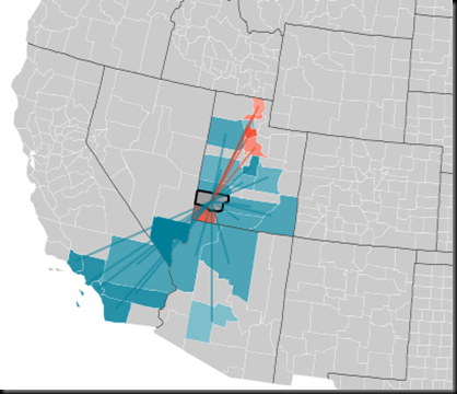
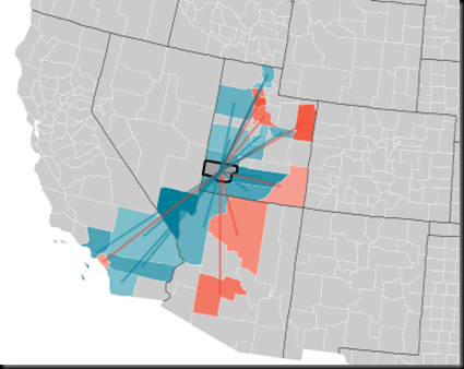
Here’s a very cool interactive map at Forbes.com that shows, by county, where immigrants came from (in blue), and where emmigrants went to (in red).
Here’s Iron County in 2005.
You can clearly see the inflows following I-15.
But, here’s 2009 (the latest year available):
What I find interesting is that the only place consistently drawing people from Cedar City is the Wasatch Front.
N.B. Also note the number of people moving to Vernal for the gas boom.


No comments:
Post a Comment