Monday, January 31, 2011

More On the Financial Crisis Inquiry

Holman Jenkins absolutely slammed the whole charade in Saturday’s issue of The Wall Street Journal.

Basically, the report says that the whole thing could have been avoided.

No, duh: just like car accidents can be avoided.

This isn’t useful unless you can say how car accidents or financial crises can be avoided. And the report doesn’t say this.

It is pointless to say it was caused by “Greedy bankers, incompetent managers and inattentive regulators …” unless you know how to make people less greedy, incompetent and inattentive.

The dissenters at least propose answers that might be answers. Peter Wallison focuses on U.S. housing policy, a diagnosis that has the advantage of being actionable.

The other dissent, by Keith Hennessey, Bill Thomas and Douglas Holtz-Eakin, sees 10 causal factors, but emphasizes the pan-global nature of the housing bubble, which it attributes to ungovernable global capital flows.

That is also true, but less actionable.

Here’s the real goal of this inquiry:

Mr. Angelides [the chair, and a former member of Congress] has gone around trying to convince audiences that the commission's finding was hard hitting. It wasn't. It was soft hitting. More than any other goal, it strives mainly to say nothing that would actually be inconvenient to Barack Obama, Harry Reid, Barney Frank or even most Republicans in Congress. [emphasis added, both times]

Chinese Inflation

Stetson brought up Chinese inflation in class on Monday. He said he’s seen it mentioned a lot, and there it was in Monday’s issue of The New York Times. The piece entitled “Inflation In China May Limit U.S Trade Deficit” cover some of the details, but paints a naïve picture of the the situation.

First, the data:

China’s inflation is running 5 percent at the consumer level, according to official measures. But Chinese and Western economists describe these measures as based on flawed, outdated techniques and say the real figure may be up to twice as high.

In contrast, the annual inflation rate in the United States is low by historical standards — about 1.5 percent currently.

There are two reasons for this. I mentioned this one:

China’s intervention in the currency market has kept its currency artificially low. But that flood of money has also driven inflation, giving Beijing an incentive to let the renminbi move higher.

I was remiss not to mention this one:

… No country offers refuge from high global commodity prices.

We need to keep our eyes focused on the primary result: it’s good when people around the world get richer. But, the secondary result of that is that it tends to bid up the prices of commodities: it isn’t just oil, but almost all commodities have had severe price inflation over the last decade.

Given all this, the legacy media still gets it all wrong by focusing on the U.S. trade deficit. They are hung up on this being a macroeconomic cause, when it is very likely an effect. Unlike reporters, I’ll actually offer you a testable proposition: if the U.S. trade deficit doesn’t drop in response to Chinese inflation, then those two variables aren’t causing much of what you see around you. Instead, capital flows are driving both. 

Saturday, January 29, 2011

Social Security

Doug Larson (our Director of Undergraduate Legal Studies) recommended a piece by Chuck Blahous entitled “The Social Security Challenge”.

Chuck was a visiting professor at SUU last year, and is now with the Hoover Institution.

I found the piece to be non-technical, but a bit dry, and not overly well-written. Anyway, it’s required.

It’s about how and why our Social Security System needs reform, and what issues policymakers agree upon (a large number), and what they don’t (mostly nonsense).

Bernanke Interview (In 2 Parts)

Jimmy La Rue recommended this interview from 60 Minutes to the rest of class. He said he learned some things from it, and I think you will too (Part 1, Part 2).

I believe this initially aired in March 2009 (it’s a surprising pain in the butt to figure that out from their site – it’s a 20th century show with a 20th century search engine I guess). I think the interview was made in February 2009.

At that time, the interviewer is shocked that Bernanke says that he thinks the recession will end that year.

Yet, the recession did end that summer, so Bernanke was right.

And, in this class in Spring 2009, we were already seeing signs of a turnaround – that are written up in this blog.

Friday, January 28, 2011

Egypt

Since we talked about this in class, I figured I’d pass on this piece of information:

Steven J. Vaughn-Nicholls:

According to James Cowie, Renesys’ CTO, “In an action unprecedented in Internet history, the Egyptian government appears to have ordered service providers to shut down all international connections to the Internet. Critical European-Asian fiber-optic routes through Egypt appear to be unaffected for now. But every Egyptian provider, every business, bank, Internet cafe, website, school, embassy, and government office that relied on the big four Egyptian ISPs for their Internet connectivity is now cut off from the rest of the world. Link Egypt, Vodafone/Raya, Telecom Egypt, Etisalat Misr, and all their customers and partners are, for the moment, off the air.” [emphasis added]

This happened about 19 hours ago …

This is the first time that a government has locked its population out of the world wide community of the Internet.

Thursday, January 27, 2011

Ease of Doing Business

This interesting graphic is from the piece entitled “Mining Fight Shows Pressure on Multinationals,” from the January 27th issue of The Wall Street Journal. If you connect to this article through the website, there are additional interactive graphics you may find interesting.

3 Stories About the Financial Crisis

The Financial Crisis Inquiry Commission has released its report. There are 3 alternative explanations.

Six commissioners argued that:

… Greedy bankers knowingly manipulated the financial system and politicians in Washington to take advantage of homeowners and mortgage investors alike, intentionally jeopardizing the financial system while enjoying huge personal gains. That's the view of the six majority commissioners.

One commissioner argued that:

… The primary cause was government intervention in the housing market. This intervention, principally through Fannie Mae and Freddie Mac, inflated a housing bubble that triggered the crisis.

Three commissioners (all Republicans) came up with this:

Both of these views are incomplete and misleading. The existence of housing bubbles in a number of large countries, each with vastly different systems of housing finance, severely undercuts the thesis that the housing bubble was a phenomenon driven solely by the U.S. government. Likewise, the multitude of financial-firm failures, spanning varied organizational forms and differing regulatory regimes across the U.S. and Europe, makes it implausible that the crisis was the product of a small coterie of Wall Street bankers and their Washington bedfellows.

Instead, they list 10 smaller causes.

Read the whole thing, entitled “What Caused the Financial Crisis?” in the January 27th issue of The Wall Street Journal.

States’ Budgets

The Capital column in the January 27 issue of The Wall Street Journal discusses how the finances in so many states got so bad. There are four reasons: the recession drove down tax revenue, legislatures were profligate in the preceding boom, Medicaid costs are going up faster than revenues, and pensions have been systematically underfunded.

Keep in mind, that the main spending component of the Obama “stimulus package” was actually transferring dollars to state governments to spend.

Wednesday, January 26, 2011

More On John Taylor

There’s an expose on him in the January 24-30 issue of Business Week entitled “The GOP’s Shadow Fed Chairman”. He apparently has the ear of a lot of top Congressional Republicans.

Perceptions and Policy

We talked a bit in class about how perceptions of policy don’t always go deep enough to be fully informed.

A case in point is TARP (the Troubled Asset Relief Program). Out on the street people think this was a bad idea that failed miserably.

In fact, it was an idea that was in every macroeconomics textbook for as long as I can remember, that was put into practice when the texts said it should be.

And it worked. Fantastically.

But check out this survey:

How is that possible? GM has been a basket case for 20 years and everyone knew it. And Chrysler has been the LA Clippers of automakers since the 1960s.

Yes, it would’ve been better if TARP never had to be … but it did. Given that it did, the textbook explanation was that it wouldn’t lose much money in the long-run, and it didn’t.

Read “Bailout Ends, Not Anger” in the October 2, 2010 issue of The Wall Street Journal.

Yellow Flags for Employment Numbers

ADP thinks the government is overstating employment numbers by nearly a million.

I don’t know enough to have an opinion about ADP’s number.

As to the government’s numbers, the big issue over the last 10 years there has been that the government’s two employment numbers – one derived from firms (the CES) and one from employees (the CPS) – had some large divergences, particularly around the middle of the last decade. The usual interpretation of this is that a lot of people were reporting themselves as employed when they only had a tenuous connection to the job market – like day traders and house flippers.

Currently the CPS numbers are pulling away from the CES numbers, which is normal in the beginning of a recovery. The light blue line above appears to be from the CES data, so the discrepancy between ADP and the CPS data would be getting even larger.

Read “Mind the Gap: Employment Figure Tell Different Stories” in the October 2-3 issue of The Wall Street Journal.

Was “the Stimulus Package” An Expansionary Keynesian Policy?

John Taylor doesn’t think so.

Taylor is on everyone’s short list for a Nobel Prize at some point – he’s been very influential on how monetary policy is actually conducted in the real world.

In the piece entitled “The Obama Stimulus Impact? Zero” from the December 9, 2010 issue of The Wall Street Journal, he and John Cogan argue that:

The key tenet of Keynesian economics is that government purchases of goods and services stimulate additional economic activity beyond the amount of the purchase itself. [emphasis added]

Taylor is not a Keynesian, so he is playing the part of the devil’s advocate. Having said that, “the stimulus package” was sold to the public as a Keynesian package.

Here’s some evidence:

Recently released Commerce Department data show that of the $862 billion stimulus package, the change in government purchases at the federal level has, thus far, been extremely small. From the first quarter of 2009 through the third quarter of 2010, government purchases have increased by only 3% of the $862 billion ($24 billion). Infrastructure spending increased by an even smaller amount: $4 billion. In a $14 trillion economy, these amounts are immaterial.

The Commerce Department also provides data on ARRA grants to state and local governments and the amount of purchases by these governments. According to these data, state and local government purchases of goods and services did not increase at all in response to the large federal stimulus grants. These purchases have remained slightly below their pre-ARRA level since the fourth quarter of 2008.

You’re reading this correctly: the portion of “the stimulus package” that was meant to be stimulating in the way it was advertised was miniscule.

(Non-Required) Trivia

The importance of the discovery of logarithms is discussed towards the bottom of the Wikipedia page.

You may also be curious to go look at the page for slide rules – it shows one doing the same sort of non-linear scaling that showed up in the first graph in your text.

(Required) Trivia

Go take a look at the Wikipedia page for e. It’s important enough to what we’re doing that compound interest is actually the first topic it discusses.

Friday, January 21, 2011

Frictional Unemployment

Frictional unemployment came up in class the other day.

The problem with this is that it is qualitative, while our measurements of unemployment are quantitative. What makes someone unemployed frictionally?

Remember there are 4 types of unemployment (in order of severity): frictional, seasonal, cyclical, and structural.

Frictional unemployment is the baseline of people who have voluntarily separated from their jobs and are looking. It’s a floor on how low we can get the overall unemployment rate. We think this is somewhere in the 4-6% range.

Over the long-term, frictional unemployment rises with the proportion of young people in the labor force. It’s probably been edging up recently because of the baby boomlet. It certainly edged up quite a bit from the mid 60’s to the mid 80’s because of the baby boom.

Over the short-term, frictional unemployment will also move opposite to the business cycle (this is called being counter-cyclical). The reason is that people are unlikely to choose to voluntarily separate from a job around a recession.

Here’s a chloropleth of unemployment rates by county in 2008:

The severity and unevenness of the recession is readily apparent. Having said that, the blue areas are probably dominated by frictional unemployment, while the other colors indicate varying degrees of cyclical and structural unemployment.

As to the other types, reported numbers include nothing about seasonal unemployment (which is actually quite large) because the announced unemployment rate is seasonally adjusted. People would panic about the economy every January if they didn’t do this.

My guess is that cyclical unemployment is pretty low right now. If it was high, we’d expect the sustained growth of the economy over the last 18 months to have reduced the overall rare quite a bit.

That means that most of the large and sustained uptick in the unemployment rate since 2008 is structural unemployment: people who can’t find jobs because their skills are no longer needed by the economy.

N.B. The link above is to Wikipedia’s unemployment site, which is pretty thorough.

Representatives Only Have to Be Representative; Smart Isn’t Required

Jimmy suggested you all take a look at this:

Obviously, it’s not required.

Wednesday, January 19, 2011

Jobs and Recoveries

David Leonhardt’s column – on the front page of the Business Day section of The New York Times – is something you should get in the habit of reading every Wednesday.

This week, he looked at how recoveries differ around the world: GDP and profits are recovering more quickly in the U.S., while employment is recovering more quickly in other countries.

He offers some speculation about why that might be, but nothing very definitive.

His biggest argument is that we’ve had 3 “jobless recoveries” in a row because labor markets are dominated by management decisions in this country. Maybe so.

One thing he doesn’t discuss – and I wish he had – is labor force participation in the various countries. Labor force participation rates tend to be quite high in the U.S., and perhaps this means we have more workers who are only tenuously attached to the workforce in the first place. But, I’m speculating …

Comparing GDP Across Countries

Within a country, we usually want to convert nominal GDP to real GDP by netting out the effects of inflation with a price index. This is not perfect because of the problems in measuring prices accurately across time: 1) quality improvements aren’t easily separable from prices, and 2) new products can’t be compared at all. We can’t talk fruitfully about per capitas and well-being until we’re satisfied with how we address this problem.

For international comparisons, the problems are worse, since countries measure their nominal GDP in their own currency.

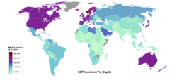
Most simply, we could just use exchange rate between two countries to put their measures in terms of the currency of one country or the other, and then use a price index to make them real. Here’s some exchange rate adjusted per capita real GDP data and a chloropleth:

The problem with this is that prices differ across countries for the same good (see The Economist’s Big Mac Index for a popular example).

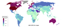
Purchasing Power Parity is the general way of correcting for this problem. The principle is similar to how you would do a real to nominal conversion within a country: you put together a “market basket” and you calculate it’s price in both places. You then weight nominal GDP so that it is higher in place where that basket is cheaper. Here’s some data on PPP-adjusted per capita GDP. In these chloropleths, exchange rate adjusted GDP is shown in the top panel (really, the same chloropleth as above, but from a different source), and PPP adjusted per capita GDP is shown in the bottom panel. Note that, just to confuse students further, it is standard to call exchange rate adjusted GDP “nominal”, even though we already call unadjusted GDP nominal.

People care about per capita GDP. Governments keep score of aggregate GDP. Here’s some data and a chlorpleth: the top panel shows PPP-adjusted aggregate GDP, while the bottom panel shows exchange rate adjusted aggregate GDP.

Neither of these measures are perfect: exchange rate adjustment tends to make countries with higher per capita GDP look better, and PPP adjustment tends to make countries with lower per capita GDP look richer than they are. The reason for both is that people adjust by buying what is locally cheap.

Professionals lean towards using PPP because … well … um … if more work goes into it, it must be better. Thoughtful professional know the true value is somewhere in the middle.

There simply isn’t any doubt that if India and China can hold themselves together, that eventually both will surpass the US in GDP. PPP tends to be used by people who think this will happen sooner rather than later.

The difficulty with this is that PPP reflects locals buying what is cheap locally. But often that is catering to local tastes. As countries become richer, their people’s tastes change, so the process of income convergence doesn’t go as quickly as one might naively expect.

Monday, January 17, 2011

The Message of Tunisia

Tunisia is in the news. Riots. Dictator fled. More riots.

What’s (naively) odd about this is that Tunisia is the most economically advanced Arab country … at least in terms of top-to-bottom quality of life indicators.

A more nuanced viewpoint is that democracy is something that the growth literature has found to be (statistically) unimportant.

The convention is that no one cares about politics and democracy until the per capita income gets about around $8K. Here’s Dani Rodrik on Tunisia.

BTW: Tunisia’s per capita GDP is about $9K.

The notion of that $8K cutoff comes from countries like Taiwan and South Korea, which were repressed but growing for decades, but hit a point where people cared more about government … once they had enough to eat and so on.

Unemployment Rates by Profession

An interactive graphic from The Wall Street Journal.

Via Marginal Revolution.

Sunday, January 16, 2011

No Happy Meals In San Francisco

Not required, but this came up in Friday’s class.

The whole thing is funny, but the 40 seconds or so starting out around the 3:25 mark is a great example of overreaching cluelessness of a government official.

Thursday, January 13, 2011

Life Expectancy as a Proxy for Well-Being

There were two other issues that I raised in class about the use of life expectancy as a measure of well-being. The links aren’t required, but the gist of them is.

Some information about how premature infants are counted can be found in this piece from the Centers for Disease Control. Most of this is about how infant mortality is measured across countries, and in some countries a prematurely born baby is not counted as a person unless it is big enough or survives long enough. This will clearly influence life expectancy statistics if some countries (like the U.S.) essentially count a lot of lifetimes of zero years.

Some information about how homicide rates have been higher in the U.S. for centuries, which will lead to lower life expectancy, can be found here.

Jones and Klenow’s Paper

The Klenow and Jones that underlies the post from Wednesday can be downloaded here. The paper isn’t required, but the general idea is.

The data that they added to go from real per capita GDP to welfare was 1) leisure time, 2) life expectancy, and 3) inequality. I don’t think it’s defendable to include inequality just because it’s politically correct, but it is defendable to include it because it gives an idea of how unrepresentative per capita GDP might be in different countries.

Life Expectancy and Scandinavians

I tossed off the remark in class that Utah’s high life expectancy might be because of the predominance of Scandinavian genes.

Internationally, life expectancies in Scandinavia rank 3, 7, 13, 25, and 36 — and all are higher than the U.S. Check out the map (this is male life expectancy only):

For the U.S., here’s a map of Scandinavian heritage:

And, here’s a map of life expectancy:

I put together a spreadsheet to support this. Utahn’s live 1.6 years longer than the average in the U.S., and 2/3 of that is explained by a naive model of Scandinavian heritage.

Supersize Me?

This is not required, but if you are interested in the brand new article whose estimates indicate that fast food is not related to obesity, it is available in the library. The cite is:

Anderson, Michael L., and David A. Matsa. 2011. "Are Restaurants Really Supersizing America?" American Economic Journal: Applied Economics, 3(1): 152–88.

DOI:10.1257/app.3.1.152

Here are some of the relevant ideas. People who like to eat out tend to be fat:

… The frequency of eating out is positively associated with greater fat, sodium, and total energy intake, as well as with greater body fat.

But it isn’t clear if restaurants cause people to be fatter, or that fatter people like to go to restaurants more:

But simple correlations between restaurant visits and overeating may conflate the impact of changes in supply and demand. People choose where and how much to eat, leaving restaurant consumption correlated with other dietary practices associated with weight gain …

This sort of situation where causation could go either way is devlishly hard to sort out — which is why it’s really important at this level to start thinking about how you might do that. Too much of our policy analysis is done by people whose thinking stops before learning to figure that out.

Broadly, these are called identification problems: you’re trying to identify the direction of causality when it isn’t readily apparent. The standard way in economics to do identification is to find a variable to include in your model that is 1) correlated with the data you are trying to explain, but 2) not correlated with theories who’s causality you are trying to sort out. Here’s what the authors do:

In rural areas, Interstate Highways provide a variation in the supply of restaurants that is arguably uncorrelated with consumer demand. To serve the large market of highway travelers passing through, a disproportionate number of restaurants locate immediately adjacent to these highways. For residents of these communities, we find that the highway boosts the supply of restaurants (and reduces the travel cost associated with
visiting a restaurant) in a manner that is plausibly uncorrelated with demand or general health practices. Using original survey data based on a smaller sample, we show that differences in travel costs generate large differences in restaurant consumption.

Basically, people in Beryl shouldn’t be as fat as people in Cedar City because it’s more expensive in time and money to eat out. This is why people from Cedar City don’t eat at Red Lobster and Olive Garden as much as people from St. George.

The estimates suggest that restaurants—both fast food and full service—have little
effect on adult obesity. The distributions of BMI in highway and nonhighway areas
are virtually identical, and point estimates of the causal effect of restaurants on the prevalence of obesity are close to zero and precise enough to rule out any meaningful effects.

… The existence of restaurants increases BMI by only 0.2 BMI points for the typical obese consumer.

Wednesday, January 12, 2011

Berri’s Happiness Stuff

Dave kindly provided his two sources (one from The New York Times, and one from Time):

The Easterlin Paradox is the result that most people are familiar with: more money makes you happier when you’re poor, but there are diminishing returns that are strong enough that more money doesn’t do much for the typical person in a developed country.

More recent research, from which the chart was drawn, shows that more money makes people happier everywhere – that’s the upward slope on all the little lines.

UPDATE: I posted this on Wednesday, but I had some trouble tracking down the Stevenson and Wolfers article that supports all this. I have it now and you can download it here. If you’re exploring further, be careful. What I found is that 1) this paper is cited differently so that it may appear that it is more than one paper (and you could waste your time), and 2) the server it is on at Wharton doesn’t download very cooperatively (so you could waste even more time). So I copied it to our server. It is a very long paper, but papers published in The Brookings Papers on Economic Activity tend to be very thorough and long, but also more accessible to students. So, if you’re interested, I’d give it a shot, but it not required.

P.S. I also have a hard copy if you want to make a copy.

What Makes People Happy?

Your location is the biggest single determinant of your productivity.

But, well-being isn’t quite the same thing as per capita GDP:

And neither of those is the same thing as happiness.

Which should be the target of government policy?

Friday, January 7, 2011

Your Tax Dollars at Work

If you ask people what parts of government spending should be cut, their cluelessness starts to show:

Note how the items they don’t want cut much above, tend to the programs we spend the most on below, and vice-versa.

Yep. Must cut foreign aid because it is less than 1/20th of what we pay for on social security. It’s fair enough to want to cut foreign aid, but it isn’t realistic to think that this is going to help much.

Wednesday, January 5, 2011

BRICs, PIIGS, and Now MAVINS

Legacy media types like these acronyms for advanced, but still developing, economies.

In macroeconomics, you need to know them to be conversant.

BRIC’s and PIIGS are old ones, and you can find write-ups on them in other parts of this blog.

MAVINS is new: this is Mexico, Australia, Vietnam, Indonesia, Nigeria, and South Africa.

Unfortunately, those in the legacy media aren’t often that sharp. Let me take some of these down.

Mexico: a good choice, bigger and richer than most people realize.

Australia: a horrible choice, a reporter probably got a free trip there to include them. Australia does not have the base population, population growth, or immigration to ever be a serious contender.

Vietnam: a great choice. Very populous, and almost a generation of making decent macroeconomic decisions.

Indonesia: a good choice. Very, very, populous, and doing pretty well for almost 40 years.

Nigeria: WTF. Big population. Not really a country so much as a bunch of tribal areas stapled together. It’s resources are badly managed, but it’s fairly common for journalists to think everything revolves around resources.

South Africa: WTF. Not quite as big a population. Not very many decent economic or political choices in a generation. Lots of bad choices prior to that. Lots of easy ground to make up, which will look impressive for a while.

Unusually, this article also contained entries on countries that almost made the list, but didn’t.

South Korea: you might be able to justify not including this one because it’s already a First World country. South Korea is already what Vietnam wants to be when it grows up.

The Philippines: a hop, skip and jump away from Vietnam and Indonesia. I tend to agree that it should be excluded right now, but this could easily change.

Pakistan: a disaster. Why even talk about it in this list? To even put it on the list without including Bangladesh (the former East Pakistan), which started out poorer, and has outstripped the former West Pakistan is to accentuate your cluelessness.

Turkey: a basically developed country, with large population, that is going to be competitive with really big and rich countries like Italy in your lifetime.

Iran: another basket case. Big population, badly managed economy, supported by arms and oil sales. This country was on everyone’s list 40 years ago. Now it is a slow motion replay of Argentina in the 20th century.

Monday, January 3, 2011

Why Congress Is a Problem

Dave Barry:

Congress tried every remedy it knows, ranging all the way from borrowing money from China and spending it on government programs, to borrowing MORE money from China and spending it on government programs.

This is Dave Barry – the columnist and humorist, not Dave Berri my colleague.

This could have been written when I first starting learning macroeconomics in Fall 1981. The only thing that changed is the source of funds, and the scale.

Rate of Return On the Panama Canal

Rates of return on nebulous investments are at the heart of figuring out finance, new growth, and how we should reward entrepreneurs and patent-holders.

Tyler Cowen has read Noel Maurer and Carlos Yu’s The Big Ditch: How America Took, Built, Ran, and Ultimately Gave Away the Panama Canal.  He notes the authors estimate:

… Aa social rate of return of nine percent for the first two decades of the canal's existence and they do include the costs of defending it.

That return would be real, but it corresponds to nominal rates of 9% in the 20’s (much worse than stock) and 7% in the 30’s (much better than stocks).

I tend to doubt you could raise money these days for a physical project of this scale that would only return 9%.

Why the World Seems Like One Big Currency Crisis

It’s all about incentives:

In 1902, European nations responded to a Venezuelan government debt default with military force. German, Italian and British gunboats blockaded ports, seized customs houses and bombarded a Venezuelan fort. Venezuela caved, agreeing to restructure and pay its debts.

These days, when European leaders see Greece and Ireland on the brink of default, they don't send gunboats--they send money.

And that behavior encourages …

I hate to sound unenlightened, and it certainly isn’t nuanced in the 21st century way, but if defaulting countries could be invaded, and have their government officials put in jail where they can’t spend their Swiss banked money, a lot of this would go away.

Sunday, January 2, 2011

Screwing Up the Payroll Tax Holiday

Leave it to Obama to screw this up. You’d need to be really “educated” to blow this one.

Payroll taxes are things like FICA that are withdrawn out of our gross pay before we get our paychecks. Normally, none of us ever sees that money again.

But, it’s been suggested since the onset of the Great Recession that a payroll tax holiday might help create jobs. But, only if it reduces the costs to employers of paying workers.

Unfortunately, the Obama administration fell in a pitfall that everyone who takes principles of microeconomics learns around week 6: that the incidence of a tax is different from who you label it as falling upon.

The calculus of the Obama decision is obvious: it’s very important to them that a tax cut not go to firms. So, their decision was to not cut the payroll taxes paid by firms, but rather to allow workers to reclaim the money that the firm would pay out anyway.

This is idiotic.

A cut in payroll taxes by firms might be passed on to workers in the form of more jobs, longer hours, or higher compensation. Then again it might not. But, this is why we study tax incidence. Most importantly though, some of a payroll tax cut that went to firms might go to people who don’t currently have jobs.

Instead, Obama has given the money to people who already have jobs. If you’re already out of work, you’re SOL.

Are Recessions Just Collective Laziness?

This is a patently offensive idea.

Until you look at time use data … and then it starts to look like a more reasonable position.

I’m not claiming that you should view this as an explanation for recessions, or even a major component of them.

Having said that, you can’t dismiss the possibility once you look at the data. Consider this infographic from The Wall Street Journal (click for a full-size version):

Between 2007 and 2009, basically from before the recession to around the end of it, time working decreased by 17 minutes per day on average. All of that and more is made up for by the 12 minute increase in average TV watching and the 6 minute increase in sleep.

Look at the work-like activities: caring for others, shopping, and household activities – collectively they’re down a bit. Talking on the phone and e-mailing is up. Other uncategorized activities (mostly web-surfing these days) is also up.

Also, education is up a little bit in gross terms. In fact, education is up by about the same percentage (7.5) that work is down. But work was and is a much bigger component (7 to 8 times larger). This suggests that the fraction of people who might actually try and better themselves through education is pretty small – maybe 15% or so of the unemployed.

Leisure of course is down by quite a bit too. This makes sense if leisure includes things that are costly, and TV does not.

This pattern isn’t really desirable. It would be a lot easier to claim that recessions aren’t collective laziness if the 17 minute drop in average working hours led to increases in caring for others (because now someone has more time), household activities (because you’re spending more time at home you should do more upkeep), charitable activities outside the home or education.

Saturday, January 1, 2011

Coercion and the Tax/Transfer State

Food for thought:

There’s a  strong element of “we’ve always done it this way” in how governments operate. If you think about it, is there really any other basis for why elective governments operate this way, other than this is the way it was done when kings had absolute power?

Just Wonderin’

In a generation, is this going to be a serious explanation of the most recent recession?

N.B. The legend is a cute touch.

The Recession In Terms of Complex Mortgages

The rise and fall of complex mortgages – interest only, negative amortization, and teasers - tracks the hotspots of the 2007-9 recession pretty well.

Southern California, Arizona and Las Vegas are pretty obvious, of course.

Look closely and you can see St. George on the tail end of that trend.

Also, you can see southwest Florida as another hotspot. Michigan too.

You can also see the areas that coasted through the recession: the high plains show very little activity at all.

Via Paul Kedrosky's Infectious Greed.

Required Returns for Residential Real Estate

Breakeven returns are as low as they’ve been in a generation:

A couple of caveats are in in order.

First, no one has been earning these rates of return – no matter how low they’ve gotten – for over 3 years.

Second, many of you may not have gotten these rates of return – no matter how low – when the market was doing well.

To see this, use the mathematical shorthand known as the rule of 72: divide 72 by a rate of return per period (years in this case) to yield the number of periods (years) for the price to double. Right now we’re at 6% in the northeast and west, and 4% in other places. That means doubling in 12 or 18 years. When I look at my house realistically – bought in a buyer’s market in 2000 in the trendy southwest – the growth rates has been 1% plus or minus 2% over that period. So I’m a loser. When I look at my previous house – bought in a buyer’s market in New Orleans in 1995 and sold into a seller’s market without an agent’s commission in 2000 – my rate of return was 6%. That’s barely above breakeven.

In southwestern Utah, everyone thinks residential real estate is a good investment. Don’t be a sheep.

Via Paul Kedrosky's Infectious Greed via Bill Ackman.